3D Illustration – Chocolate biscuit filled with chocolate 3d illustration of chocolate biscuit for use in packaging. Objective: Obtain a result of a product image that is more attractive than the real oneTechnique: 3D Modeling and Textures: ZBrushRender: Keyshot Client: Germani Alimentos
Chocolate-Covered Cookie Illustration
Illustration: Chocolate-Covered Cookie Chocolate-Covered Cookie Illustration Chocolate-Covered Biscuit – 3D Illustration This 3D illustration was created to highlight the texture and indulgence of a chocolate-covered biscuit. The goal was to achieve a highly realistic and appealing visual, emphasizing the smooth chocolate coating contrasted with the crunchy, airy interior. Careful attention was given to lighting, material definition, and surface details to enhance the sense of depth and realism. The soft reflections on the chocolate and the detailed crumb structure help communicate freshness and flavor, making the product visually irresistible. This project showcases my ability to create high-end food visuals for packaging, advertising, and branding, combining technical precision with an expressive and appetizing aesthetic.
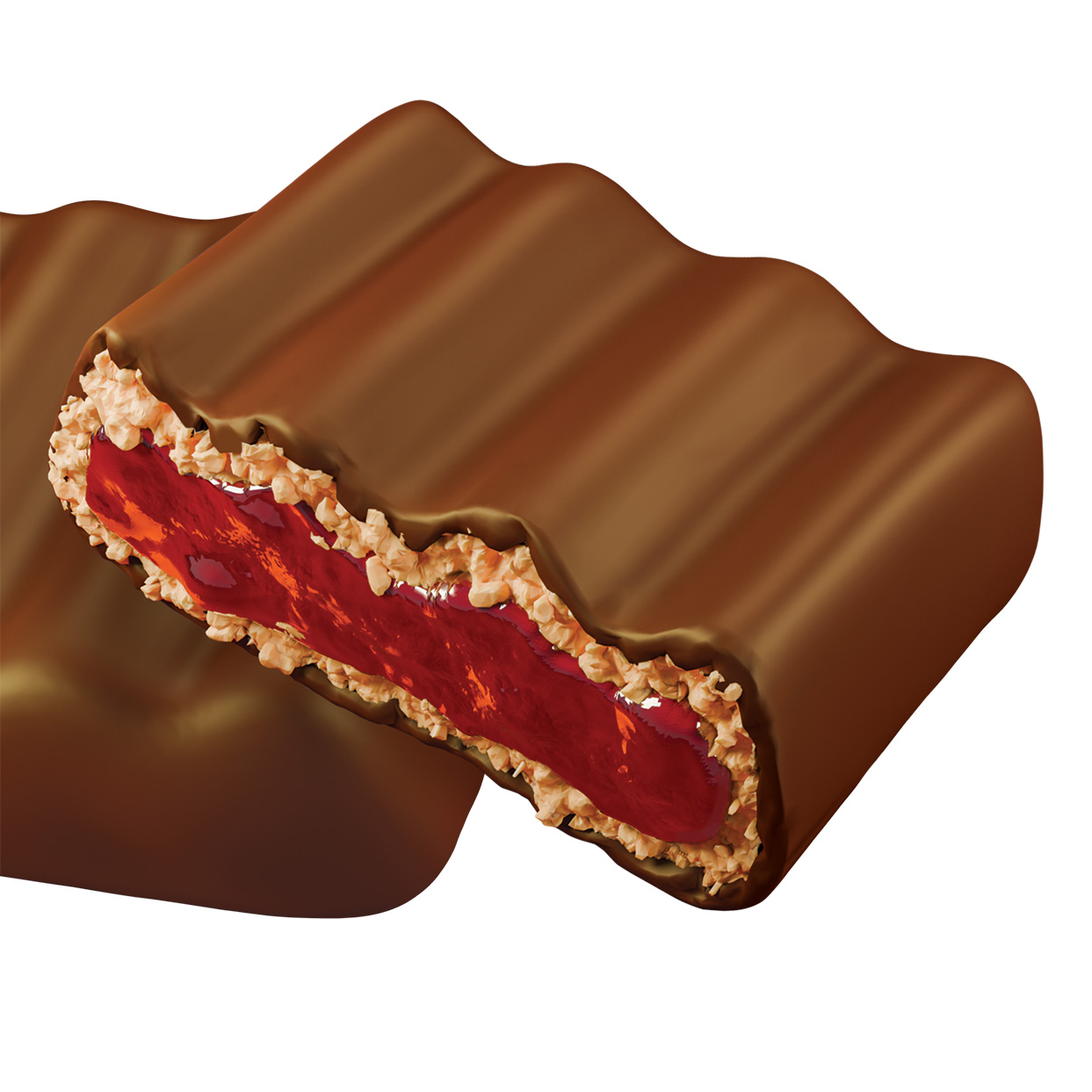
Chocolate Filled whit Cookie an Jam
Chocolate Filled with Cookie and Jam 3D Illustration This 3D illustration was created to highlight the texture and indulgence of a chocolate-covered biscuit. The goal was to achieve a highly realistic and appealing visual, emphasizing the smooth chocolate coating contrasted with the crunchy, airy interior. Careful attention was given to lighting, material definition, and surface details to enhance the sense of depth and realism. The soft reflections on the chocolate and the detailed crumb structure help communicate freshness and flavor, making the product visually irresistible. This project showcases my ability to create high-end food visuals for packaging, advertising, and branding, combining technical precision with an expressive and appetizing aesthetic.
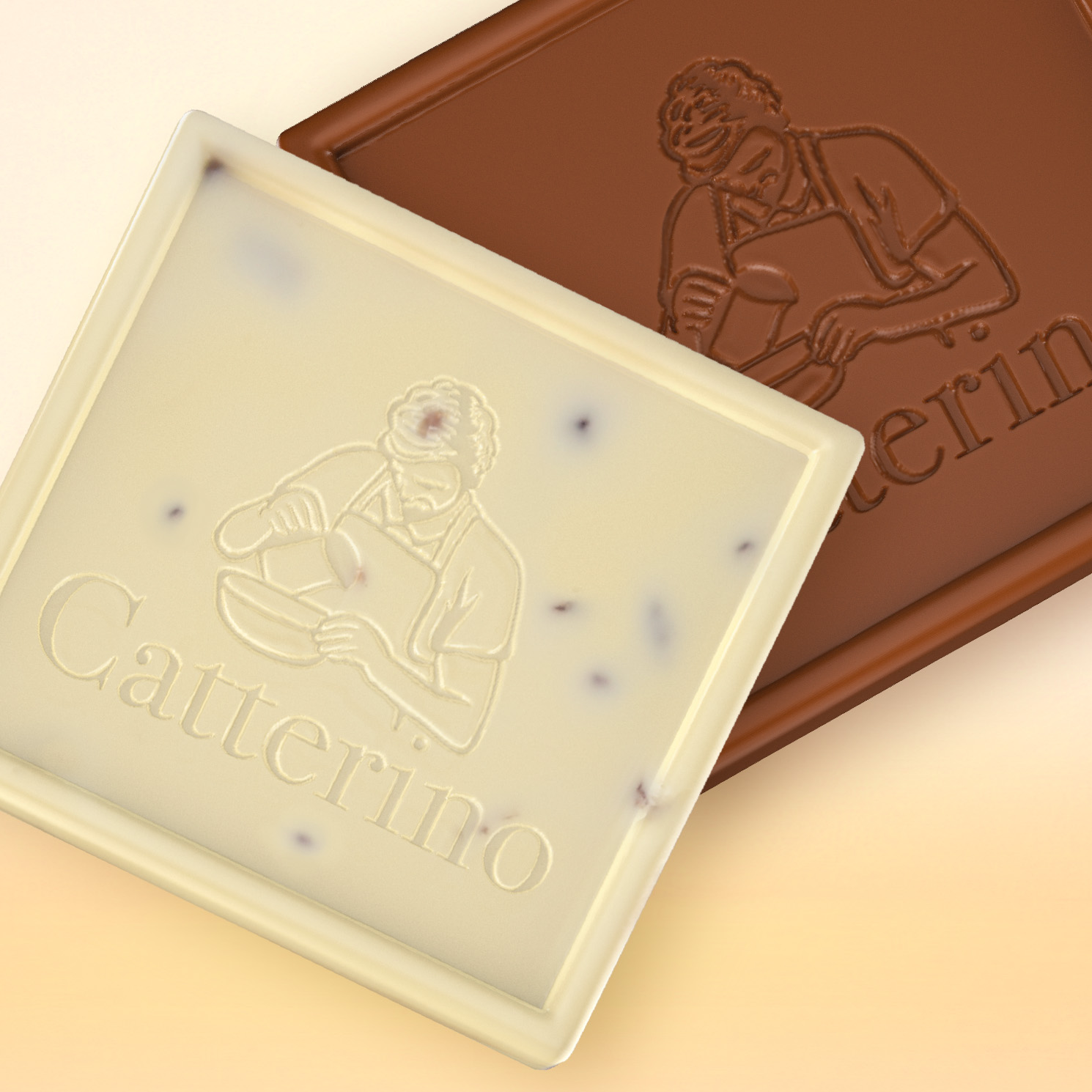
3D Illustration Chocolate
Chocolate Bar 3D Illustration – Catterino This project presents a series of 3D chocolate bar illustrations developed from a real Catterino product. The goal was to digitally recreate the chocolate while preserving its details, texture, and visual identity for use in packaging and promotional materials. The chocolate bars were digitally sculpted in ZBrush, allowing the embossed logo and the subtle surface details of the chocolate to be reproduced with precision. The final renderings were created in Blender, using carefully crafted materials and lighting to highlight the rich and natural appearance of the chocolate. The project explores how 3D modeling and rendering can be used to create appealing product visuals, enhancing the presentation of food products and expanding their use across packaging, advertising, and brand communication.
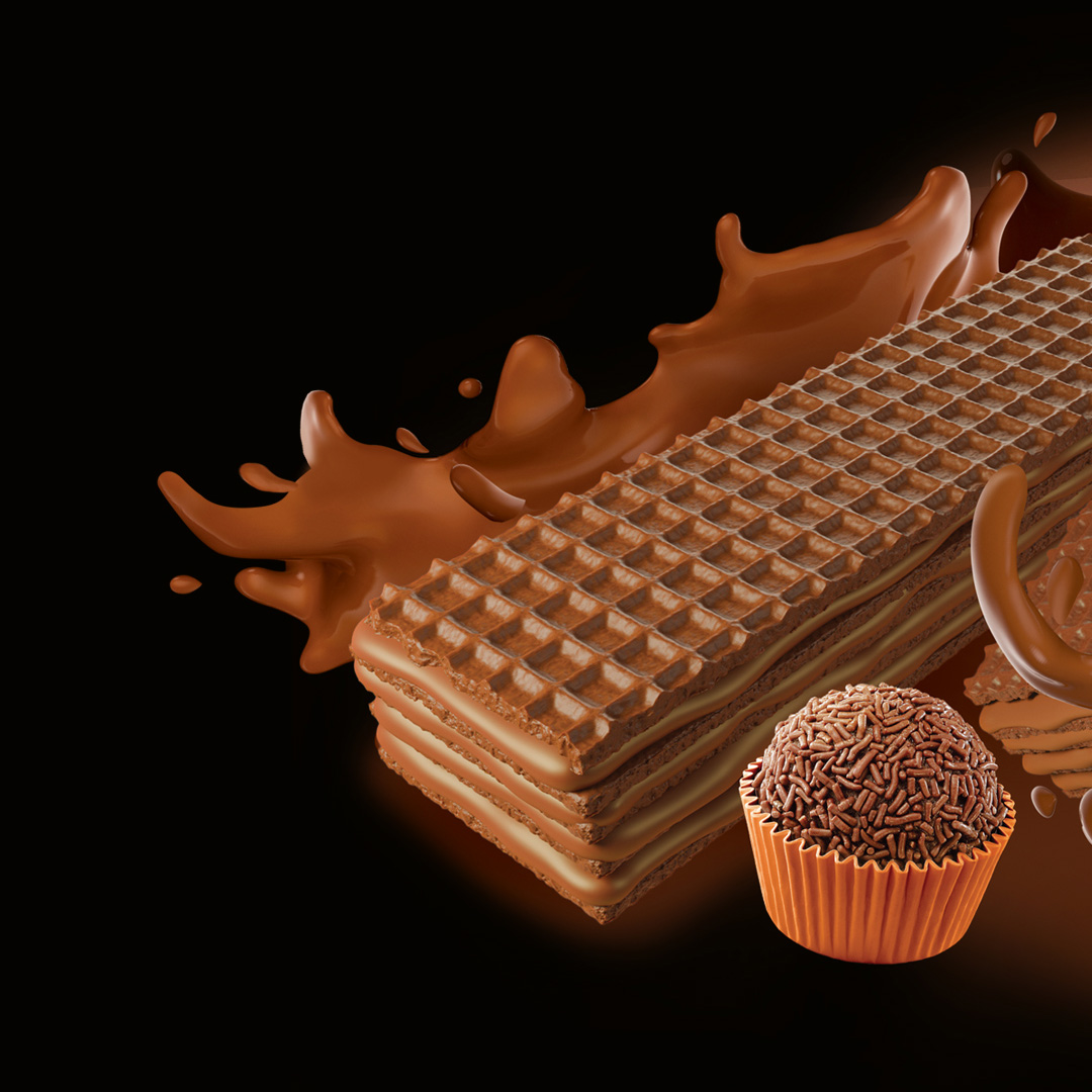
Wafer illustration
3D illustration for wafer packaging. Project developed in 3D with a focus on visual realism and performance for flexographic printing. To ensure greater color accuracy, depth, and visual appeal at the point of sale, a special Pantone 483 spot color channel was integrated, providing more vibrant colors, enhanced contrast, and improved detail readability in print.The composition was optimized for industrial reproduction, taking into account halftone limitations, dot gain, and color consistency in the flexographic process.
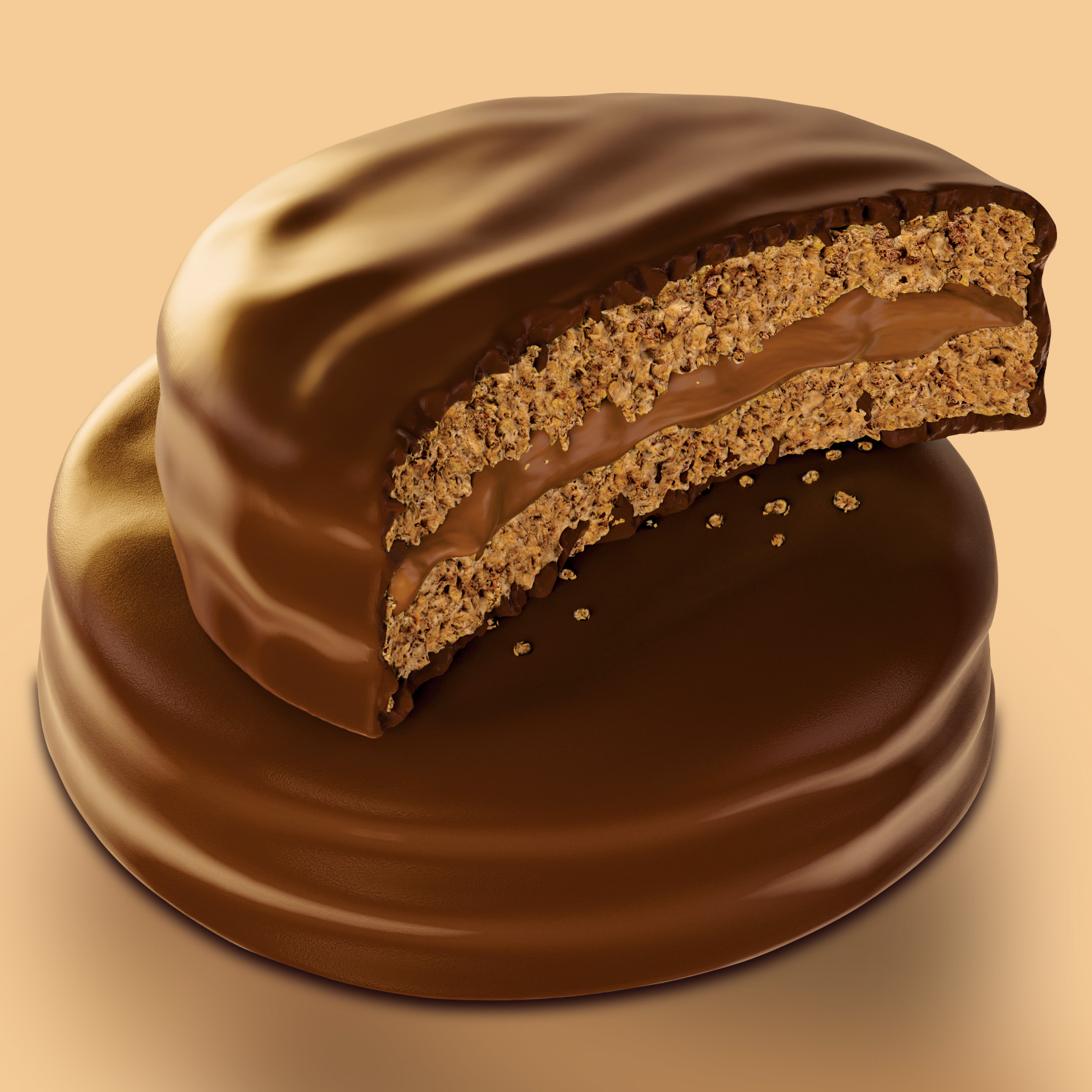
Alfajor
3D Illustration – Alfajor 3d illustration of chocolate alfajor with creamy dulce de leche filling for use in packaging, off set printing and flexography Objective: Obtain a result of a product image that is more attractive than the real oneTechnique: 3D Modeling and Textures: ZBrushRender: BlenderClient: Catterino Chocolates Process
Soul Brazil Coffee
Traditional Coffee Packaging Illustration Soul Brazil – Coffee Packaging Illustration This illustration was created as the central visual element for the packaging of Soul Brazil, a conceptual Brazilian specialty coffee brand inspired by the cultural richness and emotional intensity of Brazil. The artwork depicts three intertwined faces, symbolizing connection, identity, and shared experience. Through expressive lines, bold shapes, and vibrant colors, the composition explores themes of warmth, human presence, and the emotional depth often associated with both art and coffee culture. Unlike many packaging illustrations created digitally, this piece was produced using traditional techniques with oil pastel on paper. The texture, layered color, and organic strokes bring a tactile quality to the image, reinforcing the idea of craftsmanship and authenticity — values that align naturally with the concept of specialty coffee. Developed as part of a premium packaging concept, the illustration was designed to create a strong shelf presence while communicating an artistic and distinctive brand identity. The goal was to transform the coffee package into more than a container, turning it into a visual story that connects art, origin, and sensory experience. This project reflects my approach to packaging illustration: combining traditional media, expressive storytelling, and contemporary branding to create unique and memorable visual identities for products. Technique: Oil Pastel on PaperApplication: Coffee Packaging IllustrationCategory: Packaging / Editorial Illustration
Embalagens Criativas - Linha Animais
Creative Packaging for Chocolate – Animal Series Creative Packaging for Chocolate Dragees – Animal Series I designed a series of cardboard packages for chocolate-covered peanut dragees, focusing on visual appeal and shelf differentiation. The creative concept embraces a playful theme, featuring three illustrated animal characters: an elephant, a tiger, and a bear. Each box was crafted with a unique die-cut design that highlights the animal’s ears or key features, enhancing its charm and catching the shopper’s eye. The front window allows a clear view of the product, increasing consumer interest. The inside of the box also received special attention, with colorful patterns that enhance the unboxing experience. This packaging project blends functionality, brand identity, and visual delight — perfect for products aimed at children or as a fun, giftable treat.
Stylized food illustration
Fast Food Vector Icon Minimalist vector illustration representing a classic fast food trio: burger, fries, and soda. Using simple geometric shapes and a vibrant color palette, the design brings a contemporary and playful aesthetic—perfect for apps, digital menus, packaging, or brand identity in the food industry. Created with a focus on visual clarity and graphic impact. Stylized Fish Dish Vector Illustration Stylized vector illustration featuring a fish dish served on a cutting board with lemon slices, onions, and mushrooms. The composition uses bold geometric shapes and strong contrasts to create a modern and creative aesthetic—perfect for editorial projects, menus, branding, or digital content related to food and gastronomy. Grilled Meat Vector Illustration Original vector artwork with a modern graphic approach, depicting a stylized piece of meat on a grill, seasoned with salt and accompanied by onion rings. The diagonal lines suggest grill marks, while the use of bold geometric shapes and vibrant colors creates a striking and contemporary aesthetic. Created in Adobe Illustrator as part of a food icon series with a minimalist and conceptual style.