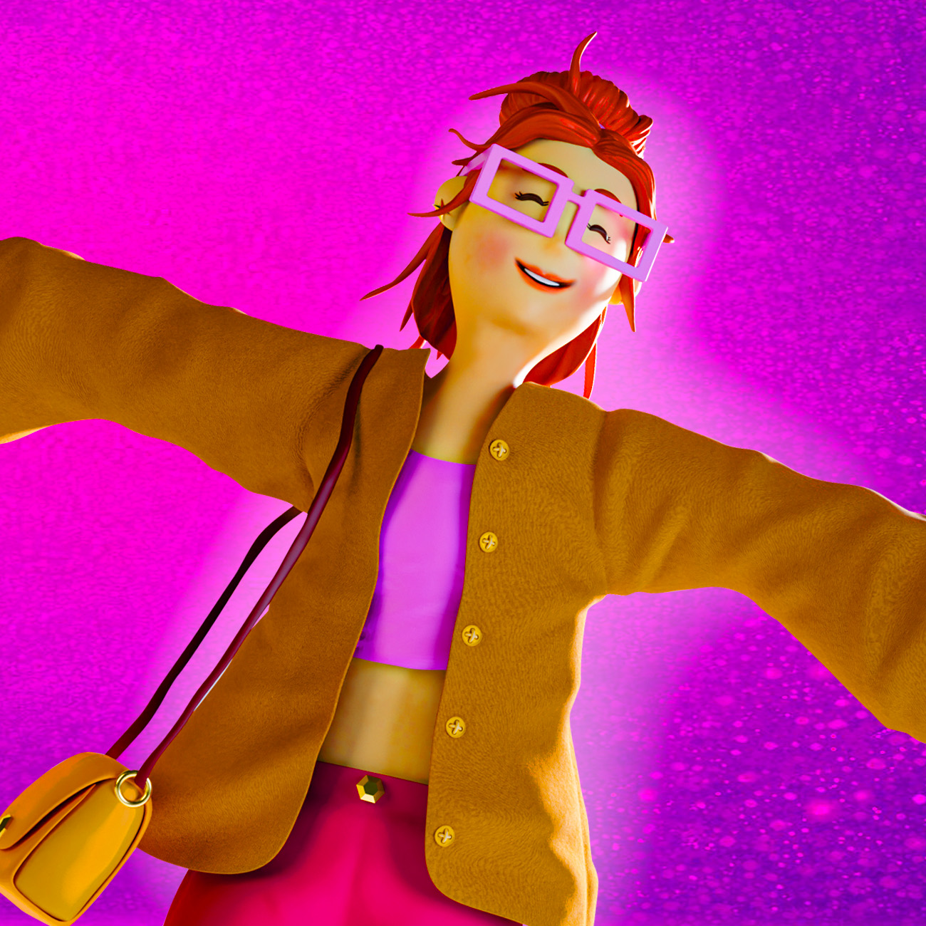
Lumi – Stylized 3D Character Design Lumi is a stylized 3D character designed to explore personality, color harmony, and contemporary fashion aesthetics. The project combines soft shapes, expressive proportions, and a vibrant color palette to create a friendly and relatable visual identity. The character was sculpted in ZBrush and finalized in Blender, with attention to materials, lighting, and pose to enhance storytelling and appeal. Lumi represents a modern, creative personality — confident, playful, and visually distinctive — making her suitable for applications such as branding, packaging, advertising, and digital content. Tools:ZBrush, Blender Process
Street Basketball Illustration
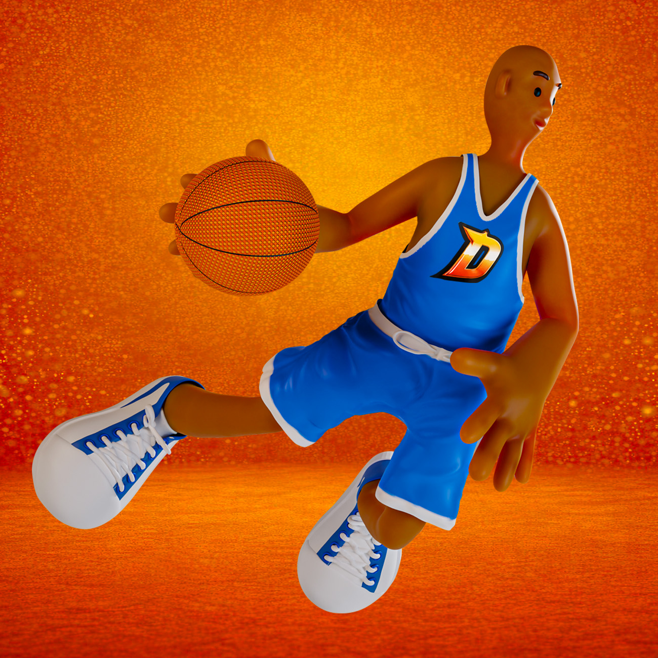
DRIBBLZ – 3D Character Illustration DRIBBLZ – 3D Character Illustration DRIBBLZ is a conceptual snack brand inspired by the energy and culture of street basketball. The goal of this project was to create a bold and dynamic packaging design that captures movement, attitude, and youth culture. The 3D character acts as the brand mascot, bringing personality and action into the visual identity. The composition integrates the product with the character’s movement, creating a sense of flow and impact on the shelf. DRIBBLZ is not just a snack — it’s part of the game.
Skateboarder
3D Character + Packaging Concept for Snack Brand 3D illustration developed for a potato snack package, created for a generation always on the move.Inspired by skate culture, street art, and urban energy, the 3D mascot represents freedom, movement, and personality.Born from the streets, GRINDZ captures the vibe of the asphalt, the sound of wheels on concrete, and the energy of those who never stop. Modeled in ZBrush and rendered in high resolution in KeyShot, the project combines vibrant colors, fluid shapes, and a fun style to convey a sense of movement and freedom. This work highlights my ability to create expressive and impactful 3D characters for commercial and promotional use. https://rfj.art.br/wp-content/uploads/2025/04/WhatsApp-Video-2026-03-13-at-16.52.11.mp4
Soccer Kick
3D Cartoon Character – Soccer Kick This 3D illustration features a stylized cartoon character, capturing the energy and motion of a soccer player kicking a ball. With a dynamic pose and vibrant colors, the design is ideal for advertising applications, including digital campaigns, promotional materials, and interactive content. Modeled in ZBrush and rendered in high resolution in KeyShot, this project combines smooth shapes, expressive movement, and a fun, engaging style to bring action and excitement to any visual composition.This work showcases my ability to create eye-catching and expressive 3D characters for commercial and promotional use.
Chocolate biscuit
3D Illustration – Chocolate biscuit filled with chocolate 3d illustration of chocolate biscuit for use in packaging. Objective: Obtain a result of a product image that is more attractive than the real oneTechnique: 3D Modeling and Textures: ZBrushRender: Keyshot Client: Germani Alimentos
Chocolate-Covered Cookie Illustration
Illustration: Chocolate-Covered Cookie Chocolate-Covered Cookie Illustration Chocolate-Covered Biscuit – 3D Illustration This 3D illustration was created to highlight the texture and indulgence of a chocolate-covered biscuit. The goal was to achieve a highly realistic and appealing visual, emphasizing the smooth chocolate coating contrasted with the crunchy, airy interior. Careful attention was given to lighting, material definition, and surface details to enhance the sense of depth and realism. The soft reflections on the chocolate and the detailed crumb structure help communicate freshness and flavor, making the product visually irresistible. This project showcases my ability to create high-end food visuals for packaging, advertising, and branding, combining technical precision with an expressive and appetizing aesthetic.
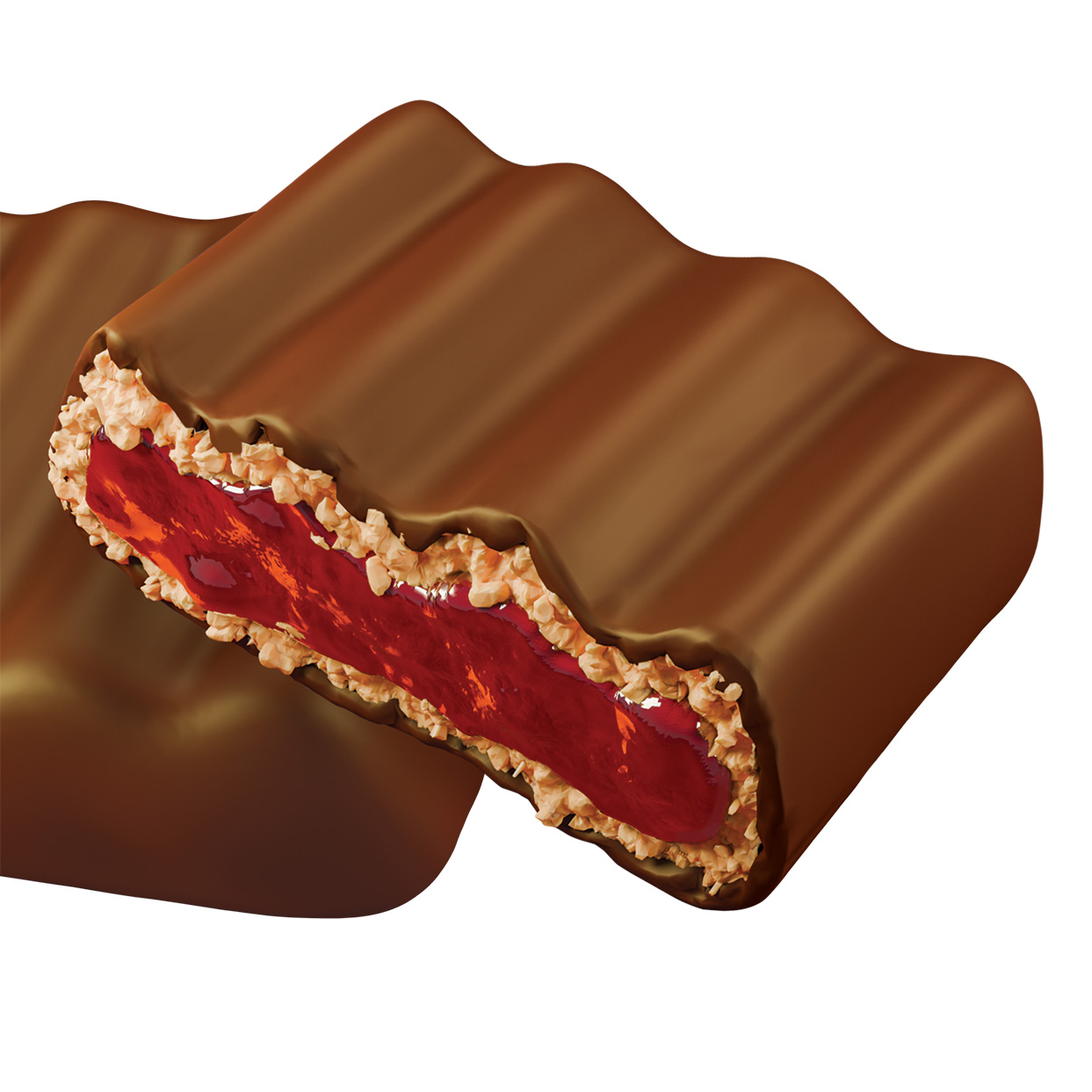
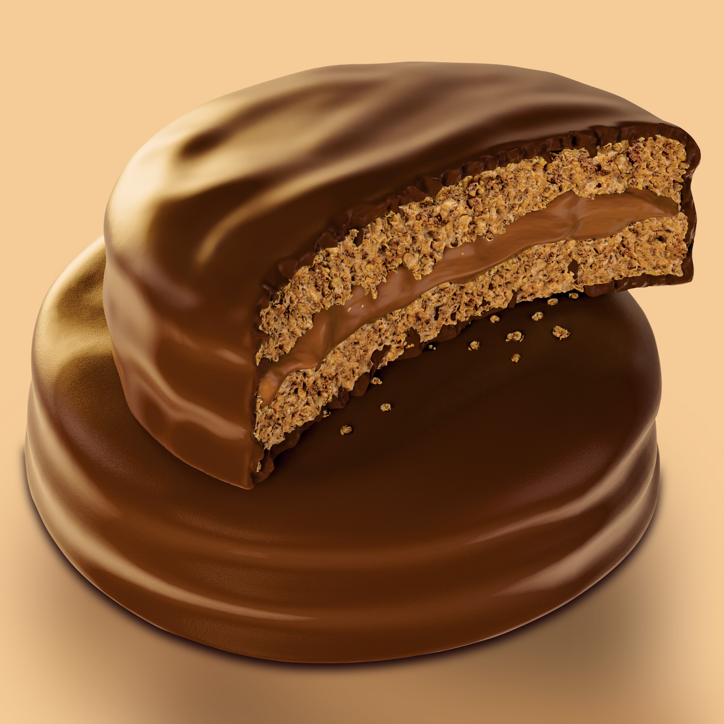
Chocolate Filled whit Cookie an Jam
Chocolate Filled with Cookie and Jam 3D Illustration This 3D illustration was created to highlight the texture and indulgence of a chocolate-covered biscuit. The goal was to achieve a highly realistic and appealing visual, emphasizing the smooth chocolate coating contrasted with the crunchy, airy interior. Careful attention was given to lighting, material definition, and surface details to enhance the sense of depth and realism. The soft reflections on the chocolate and the detailed crumb structure help communicate freshness and flavor, making the product visually irresistible. This project showcases my ability to create high-end food visuals for packaging, advertising, and branding, combining technical precision with an expressive and appetizing aesthetic.
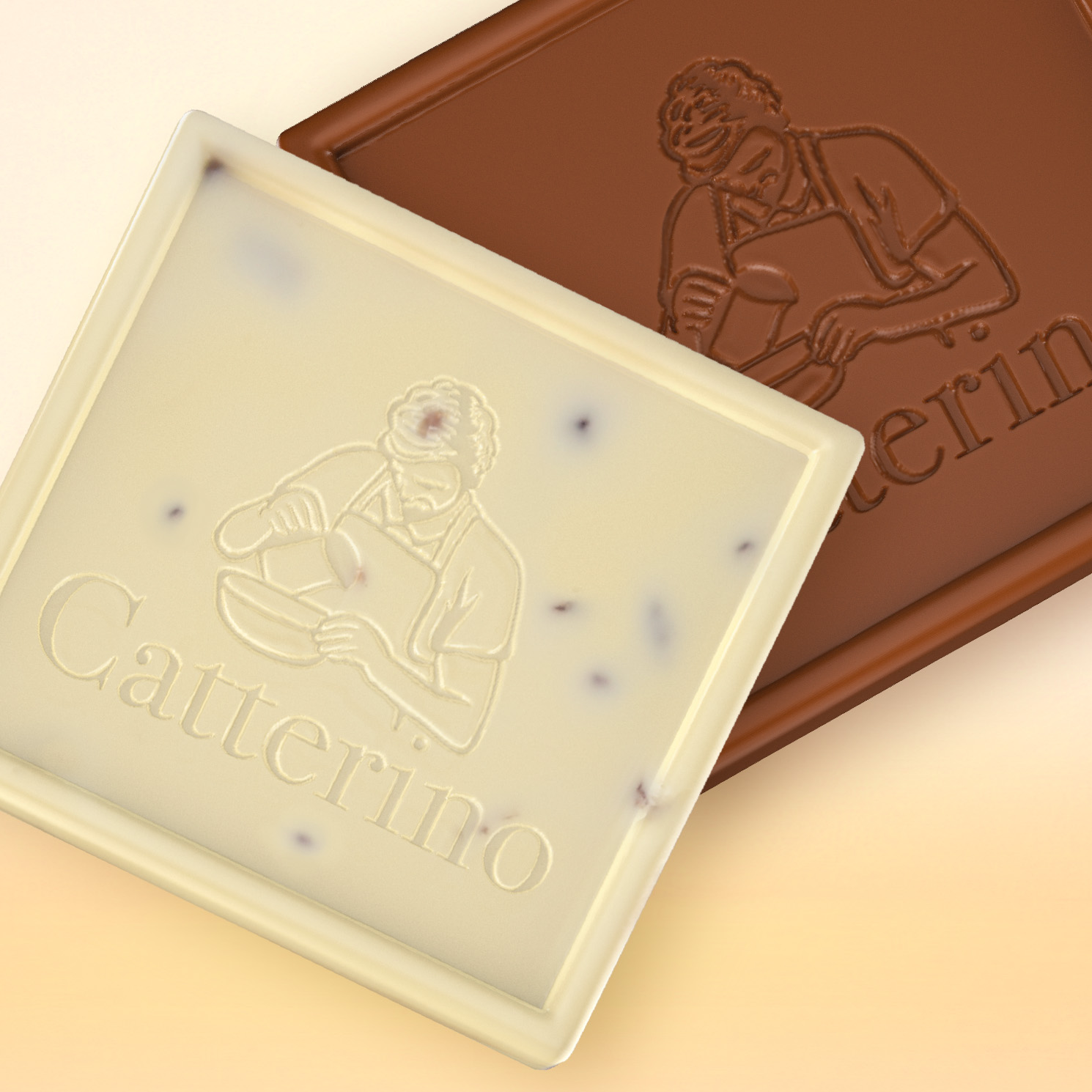
3D Illustration Chocolate
Chocolate Bar 3D Illustration – Catterino This project presents a series of 3D chocolate bar illustrations developed from a real Catterino product. The goal was to digitally recreate the chocolate while preserving its details, texture, and visual identity for use in packaging and promotional materials. The chocolate bars were digitally sculpted in ZBrush, allowing the embossed logo and the subtle surface details of the chocolate to be reproduced with precision. The final renderings were created in Blender, using carefully crafted materials and lighting to highlight the rich and natural appearance of the chocolate. The project explores how 3D modeling and rendering can be used to create appealing product visuals, enhancing the presentation of food products and expanding their use across packaging, advertising, and brand communication.
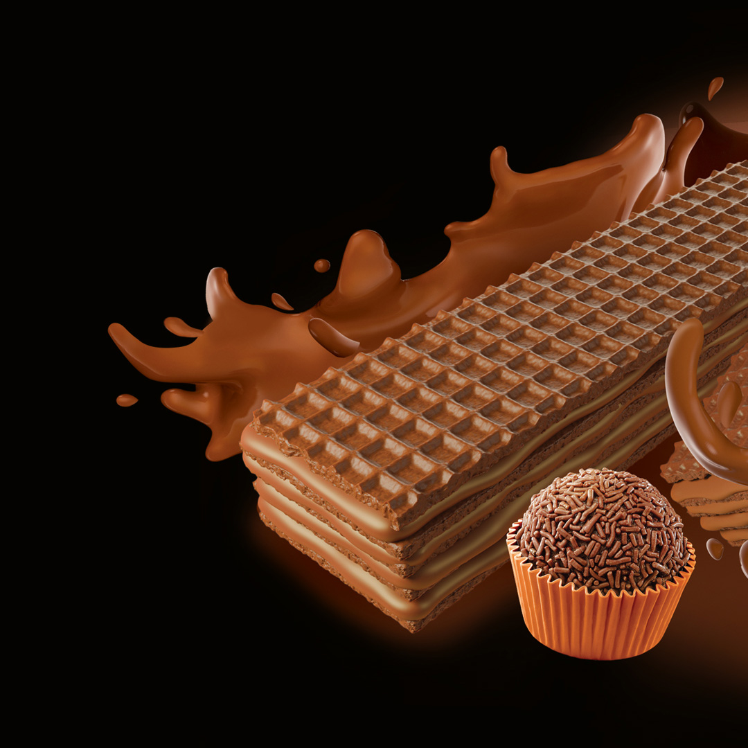
Wafer illustration
3D illustration for wafer packaging. Project developed in 3D with a focus on visual realism and performance for flexographic printing. To ensure greater color accuracy, depth, and visual appeal at the point of sale, a special Pantone 483 spot color channel was integrated, providing more vibrant colors, enhanced contrast, and improved detail readability in print.The composition was optimized for industrial reproduction, taking into account halftone limitations, dot gain, and color consistency in the flexographic process.
Alfajor
3D Illustration – Alfajor 3d illustration of chocolate alfajor with creamy dulce de leche filling for use in packaging, off set printing and flexography Objective: Obtain a result of a product image that is more attractive than the real oneTechnique: 3D Modeling and Textures: ZBrushRender: BlenderClient: Catterino Chocolates Process